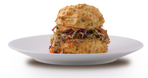
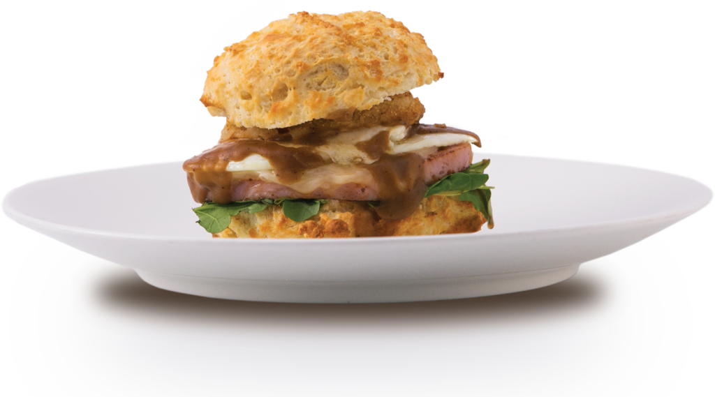
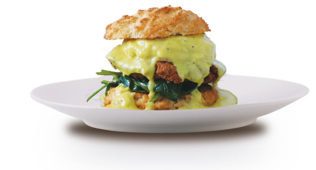
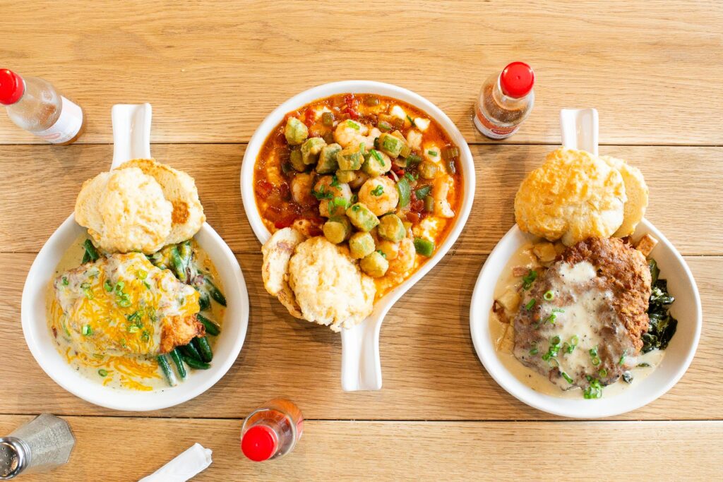
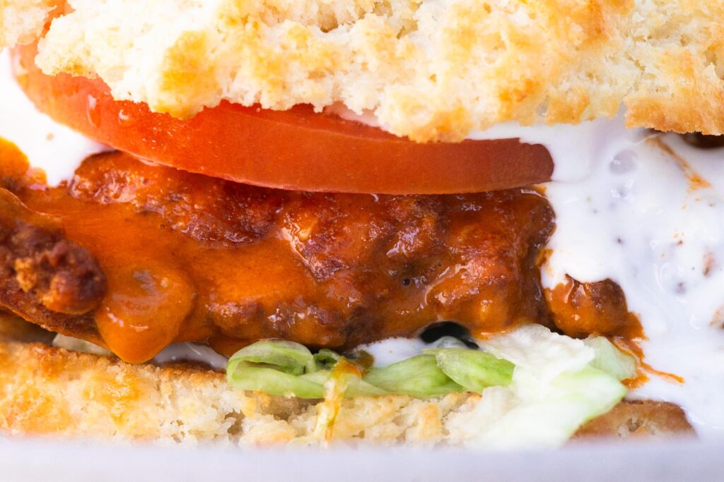
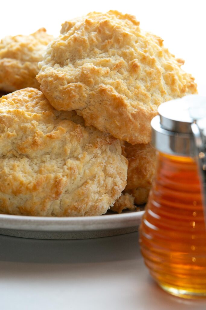
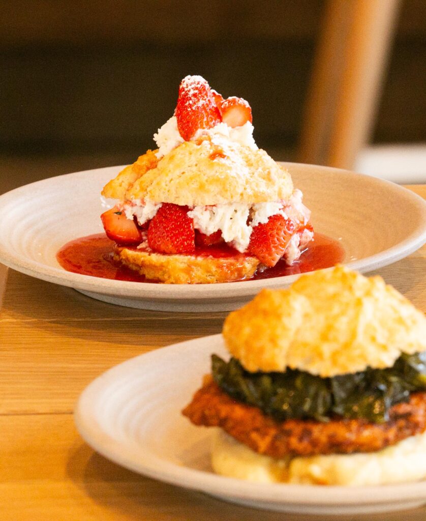
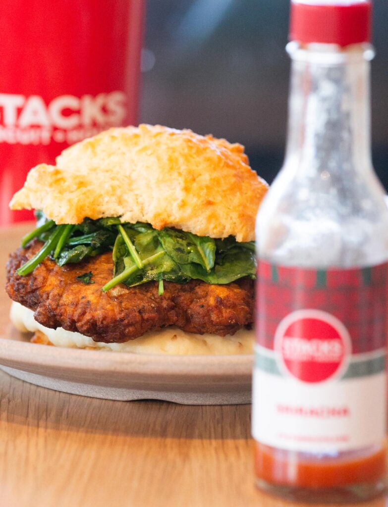
STACKS Biscuit House was born a star in the fast casual restaurant space. Newstream teamed up with Executive chef Bill Trevino up to create a powerful biscuit brand that captivated North Texas. Stacks was musically inspired by its name and deep rooted Motown importance. From biscuit sandwiches, to biscuit and gravy flights Stacks served up flavor in every bite and marketing messages.
Summary
01
Musically
Inspired
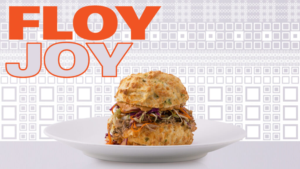
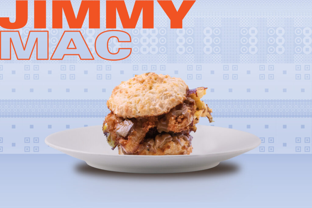
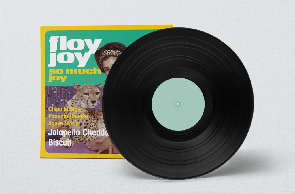
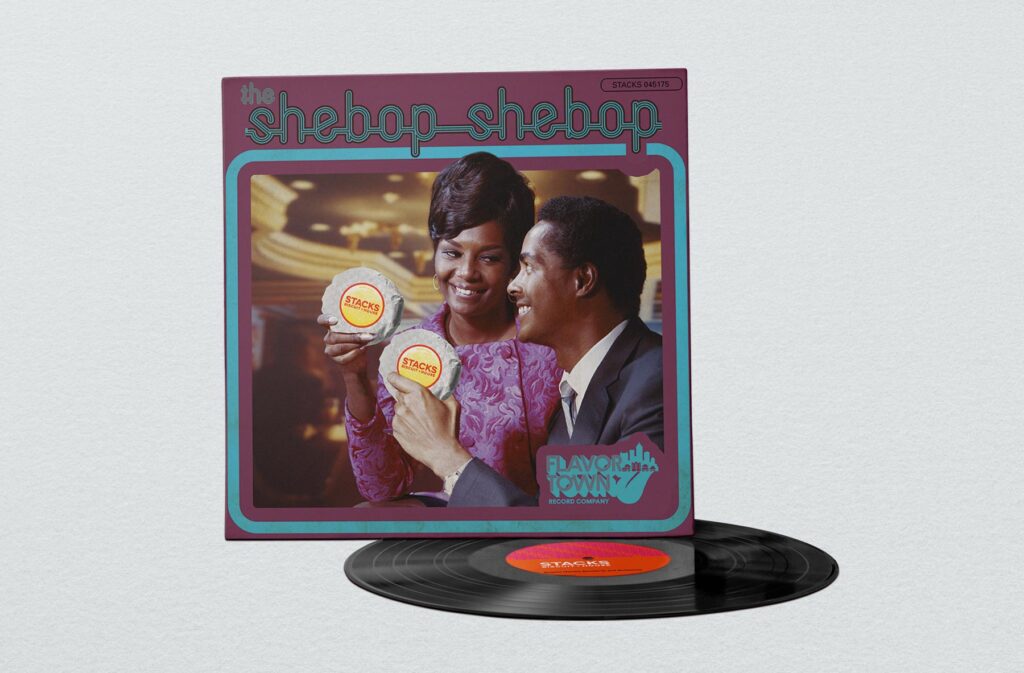
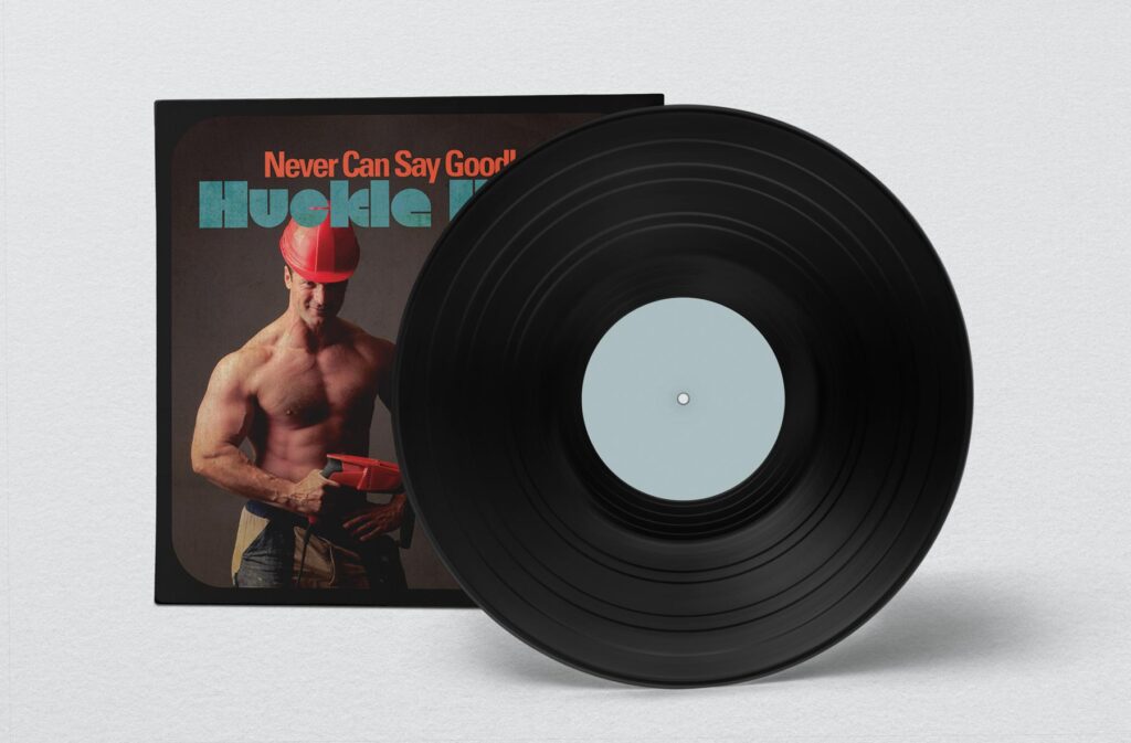
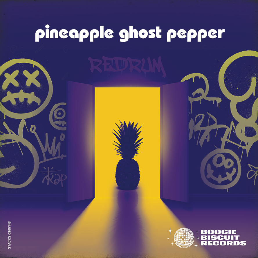
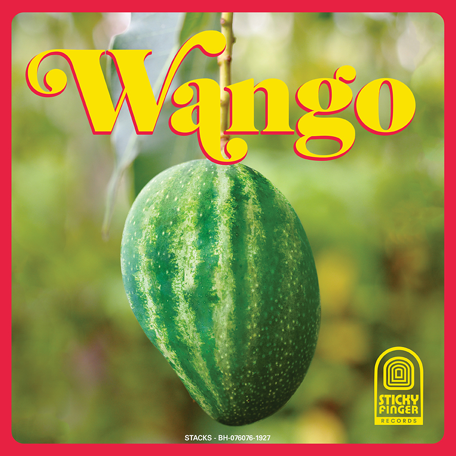
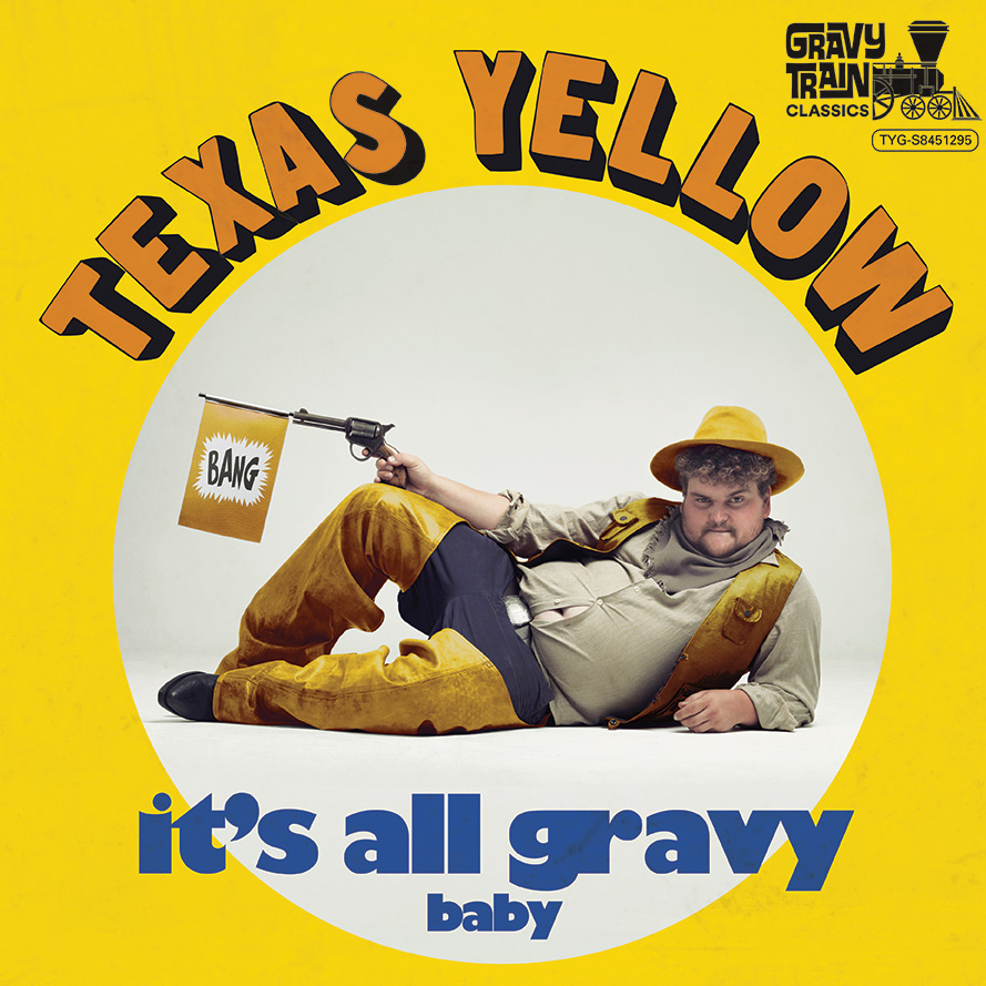
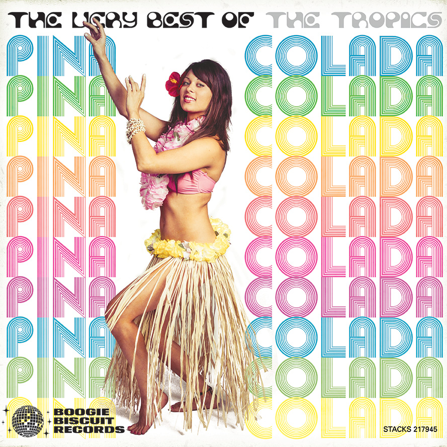
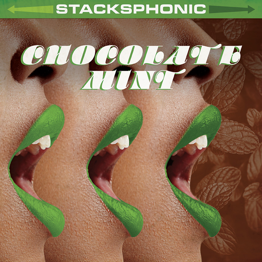
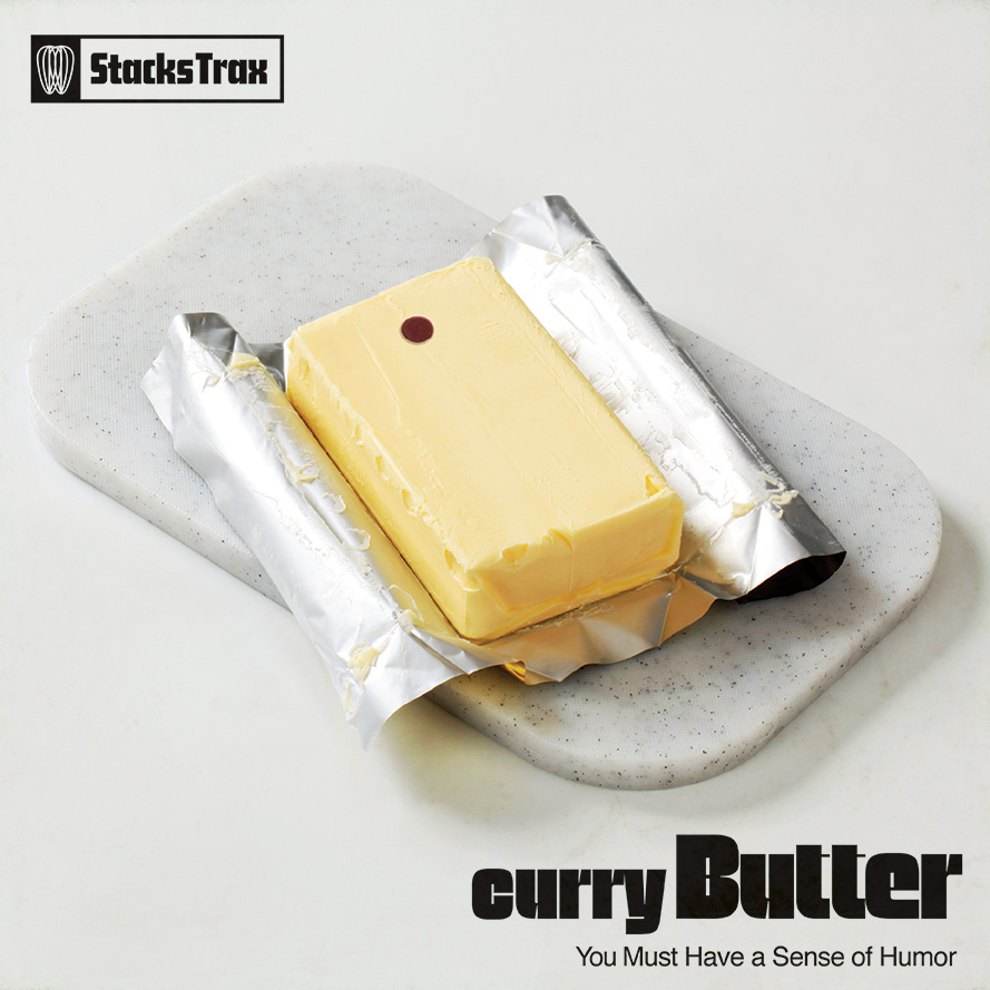
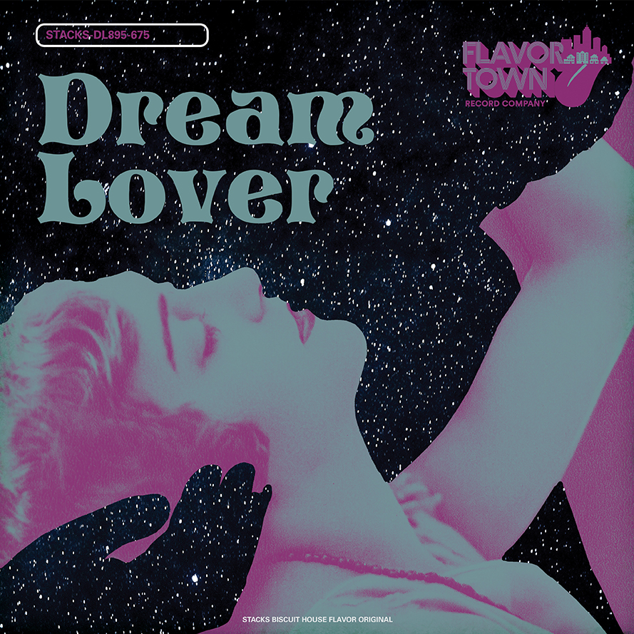
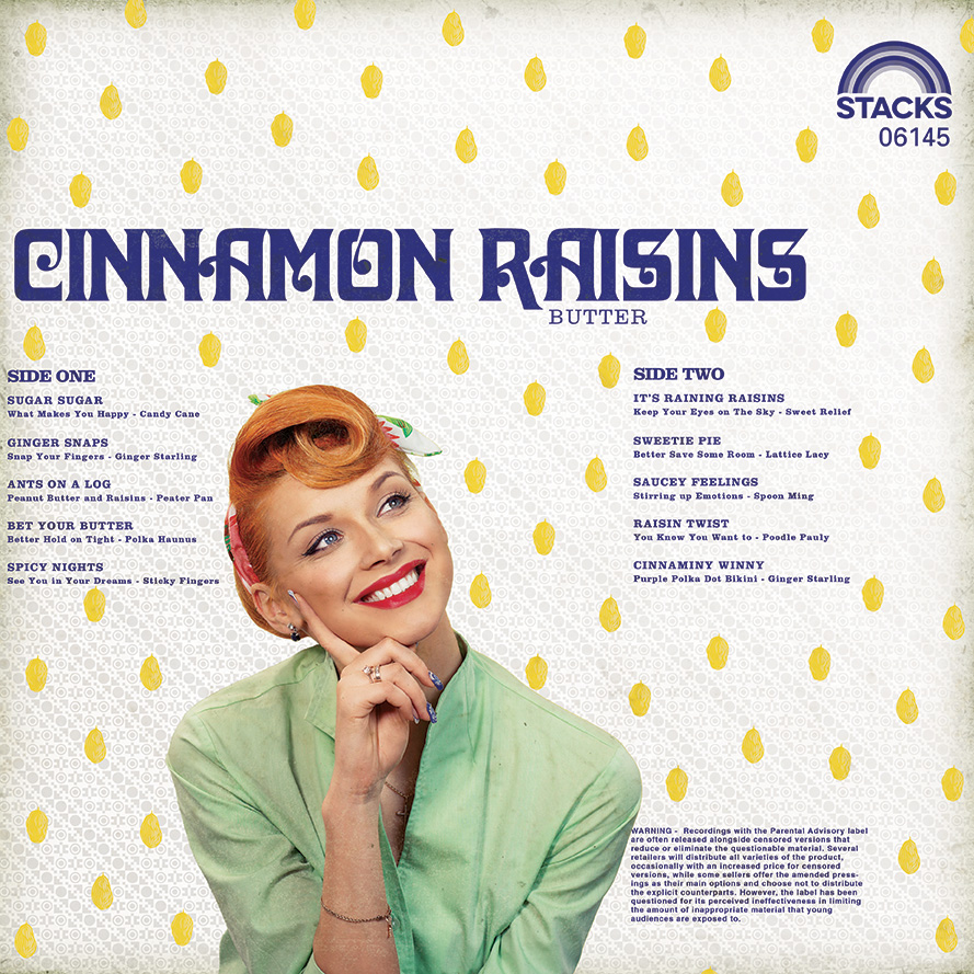
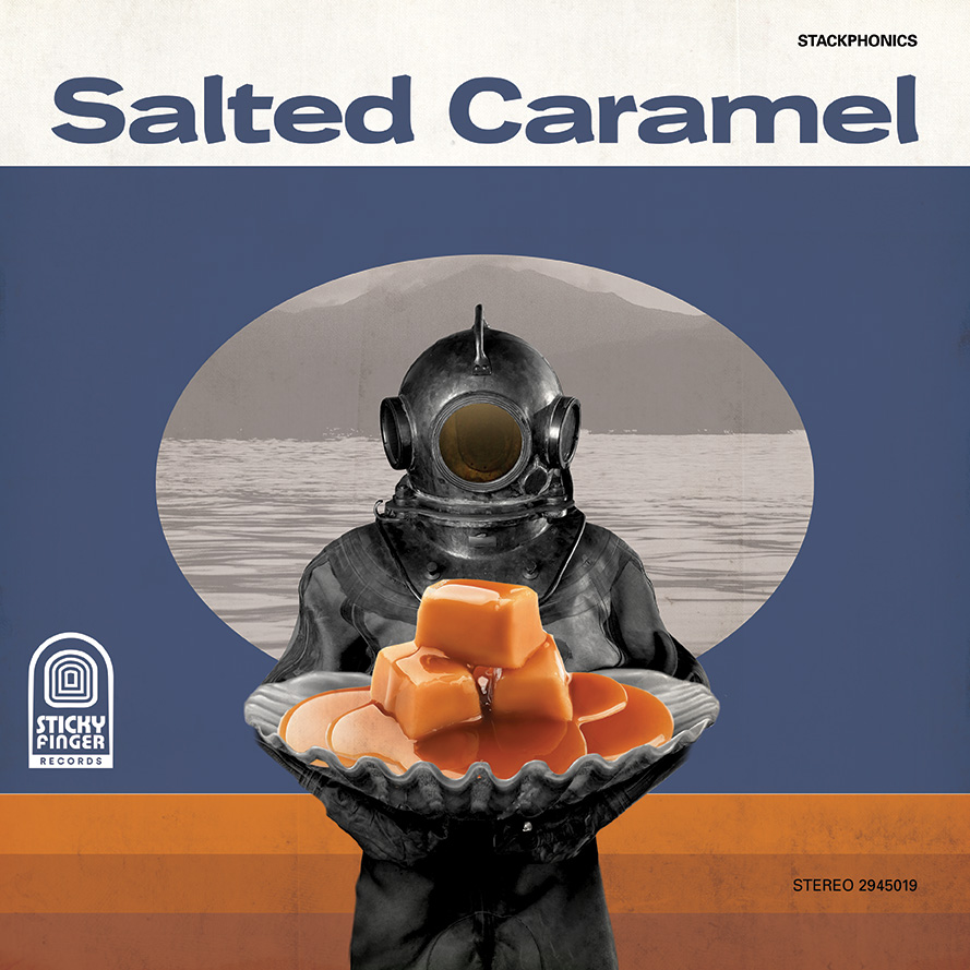
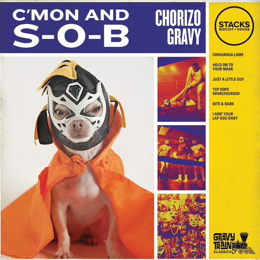
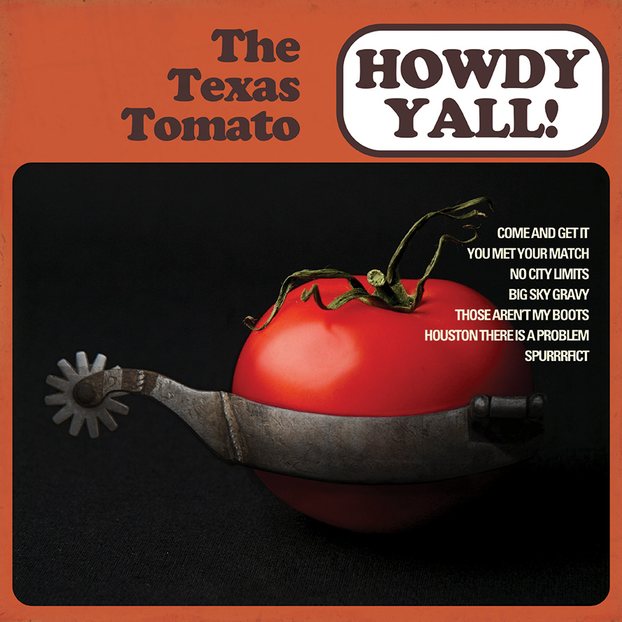
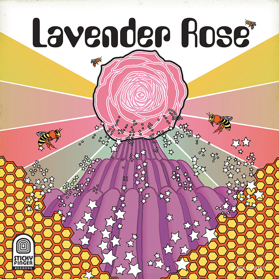
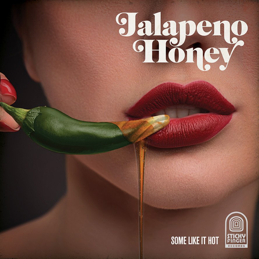
Stacks Biscuit House soul is rooted deep in the grooves of the classic vinyl records from Motown. From the lighthearted names inspired from lyrics and song titles, to the custom album covers we created for each menu item, Stacks was grooving to the beat of North Texas.
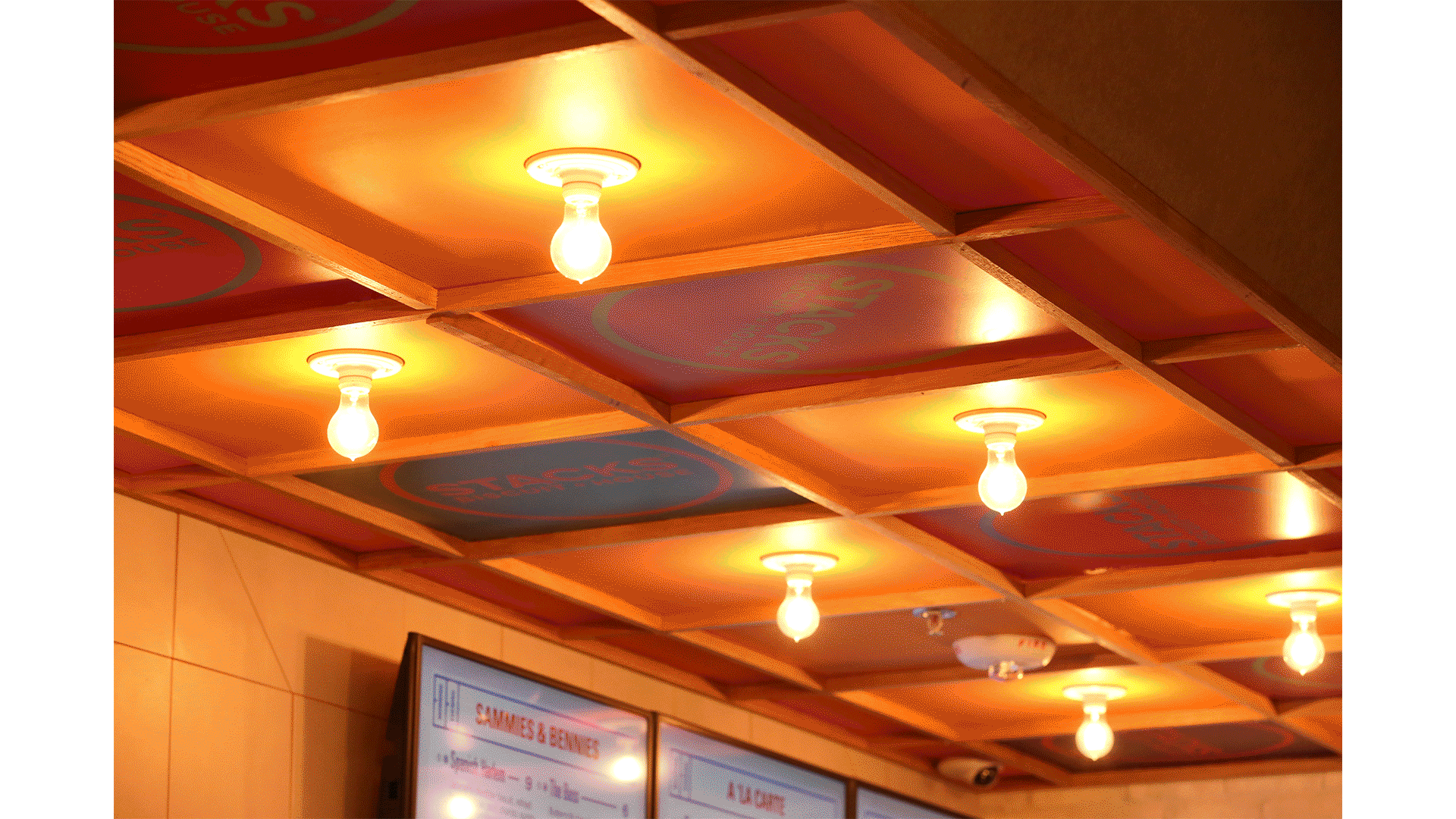
The album art work was used in a variety of art direction, from hang tags to wall murals. With lighthearted names like, ‘Wango’ and ‘Oggum Boogum’ there was no creative record sleeve we did not turn when creating the Key artwork for the brand.
Messaging
02
Biscuit
in Cheek
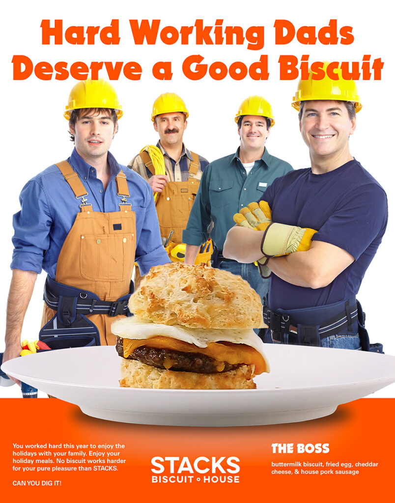
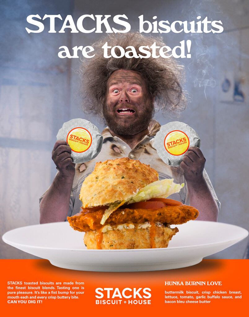
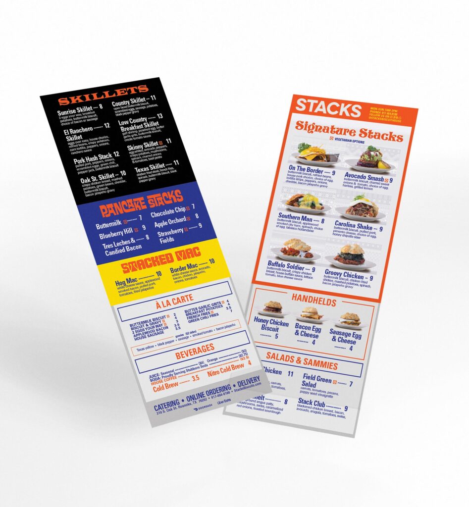
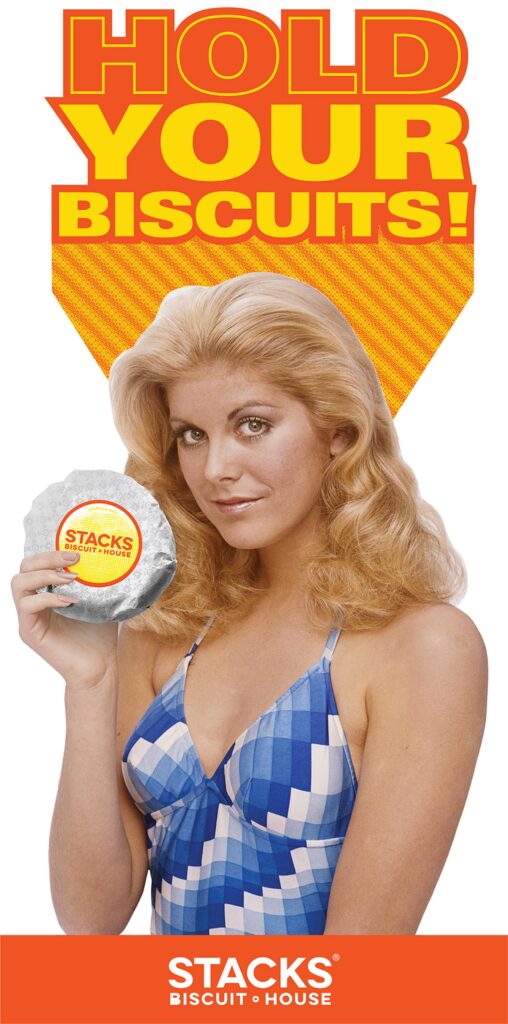
Finding your voice can be difficult for any marketing plan. No matter how great the design and branding concept is. When marketing your restaurant, you have to be flexible and take everything in stride.
With body copy so fresh its grand parents haven’t meet yet, the messaging for Stacks was attention grabbing to say the least. The success of the marketing efforts for stacks built a devoted following who lined out the door for its opening month. Much of the comedic approach though memes and restaurant highlights was well received.
Branding
03
Hold Our
Biscuits
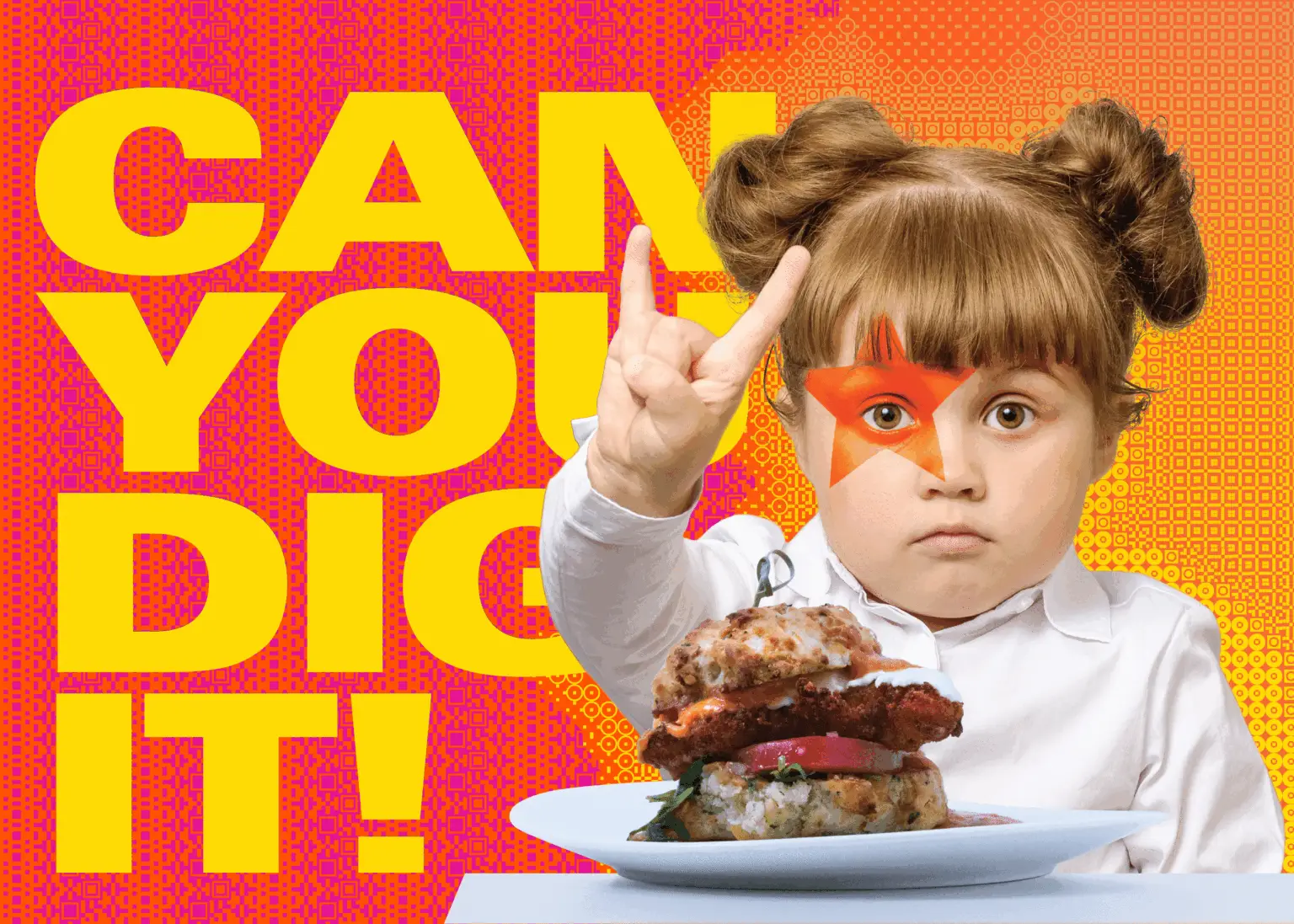
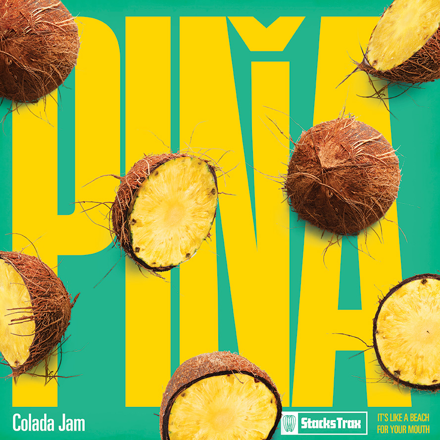
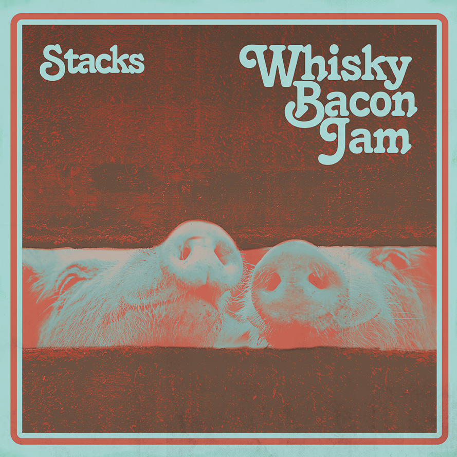
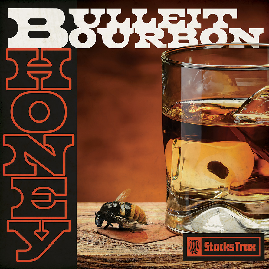
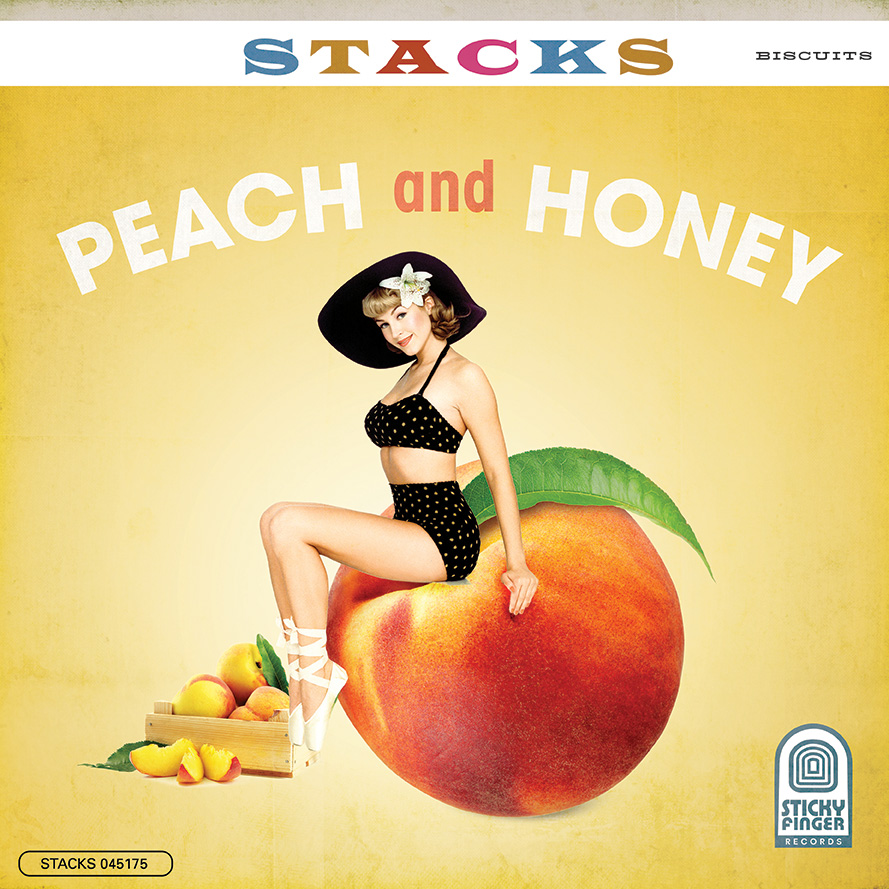
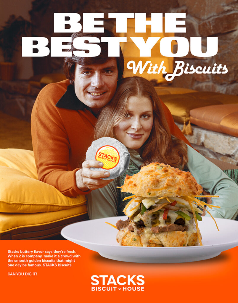
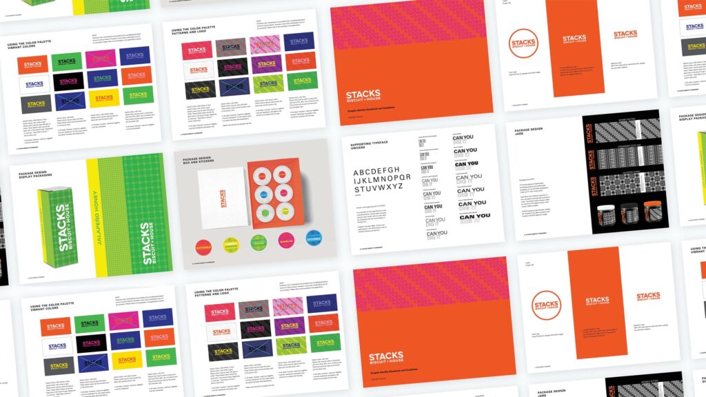
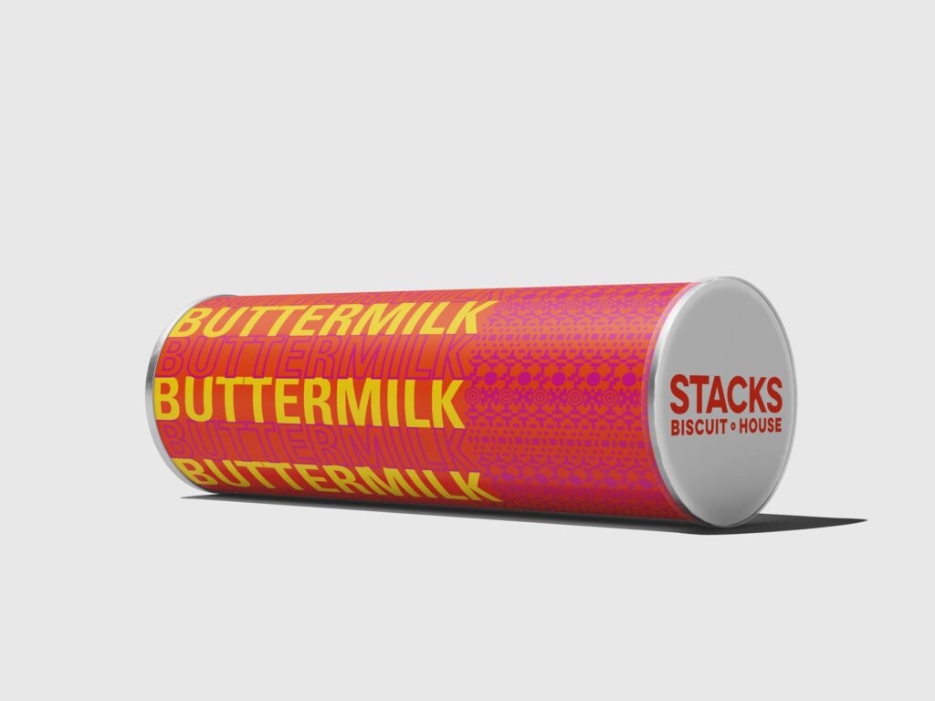
With a food so bold you’ll wanna slap your momma, we couldn’t vier away from the spotlight. The bold color palette and strong geometric patterns created a visual identity that stops you in your tracks.
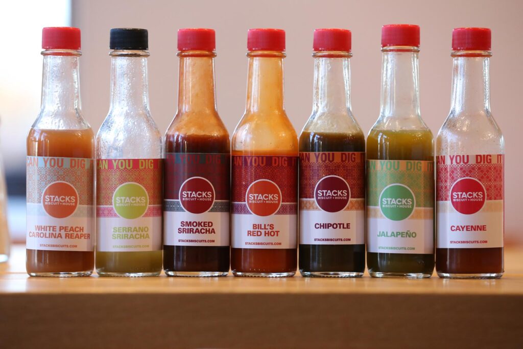
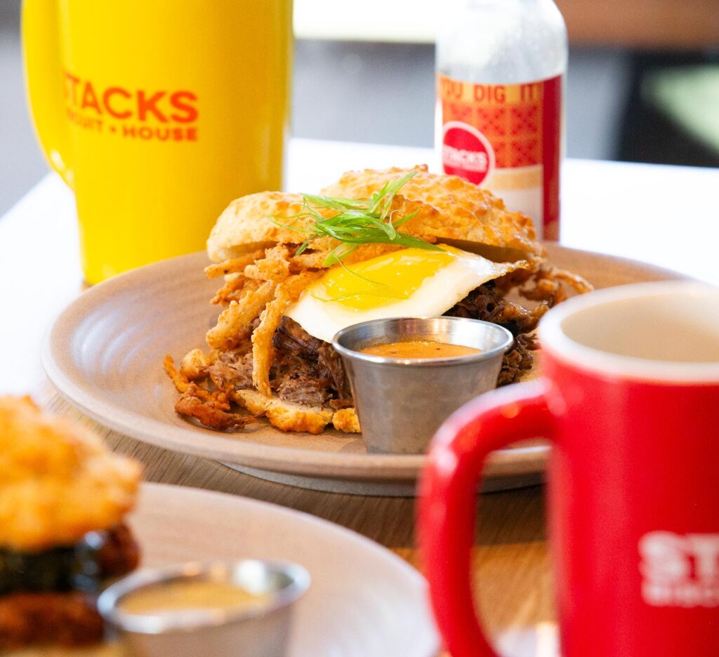
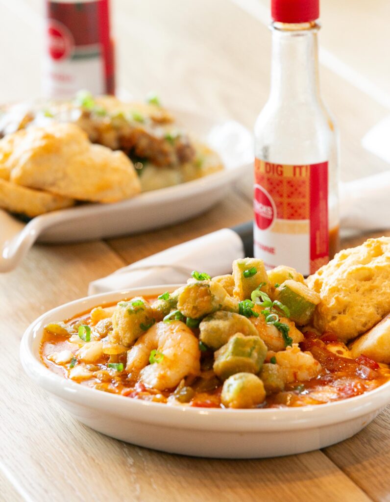
‘Can you dig it!’ was heavily used as the main strapline in all packaging and formal marketing. This common phrase from the 60s begs the audience to engage with the brand as they ultimately have to decide whether they like or dig the concept. From biscuit to containers, hot sauce and honey jars, to even the digital menu boards, the very flower child essence was tastefully curated for the brands Visual DNA.
Visual Identity
04
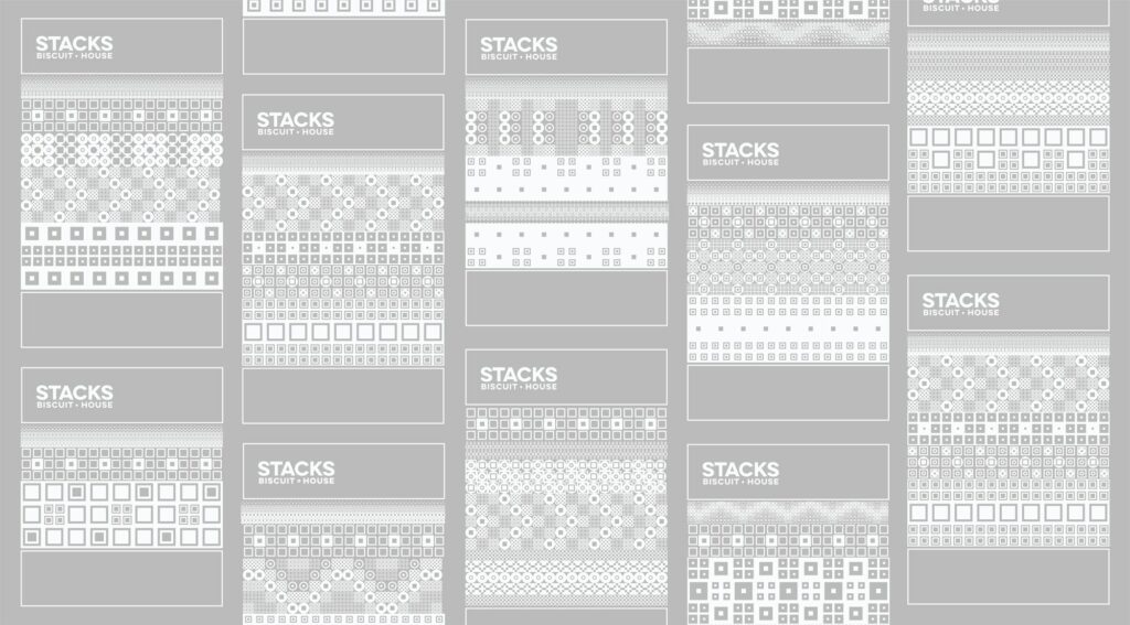
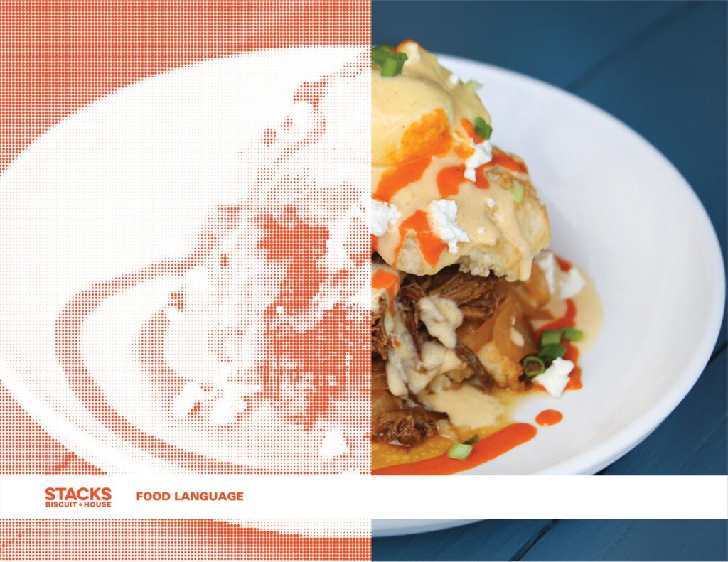
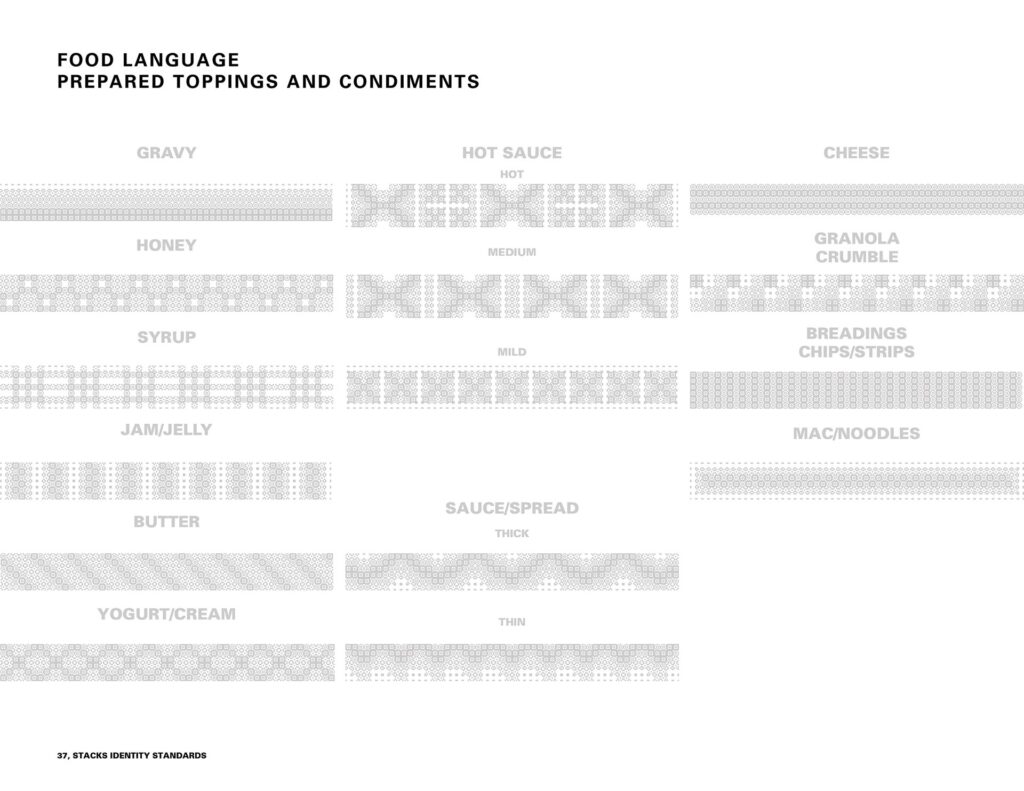
Food
Language
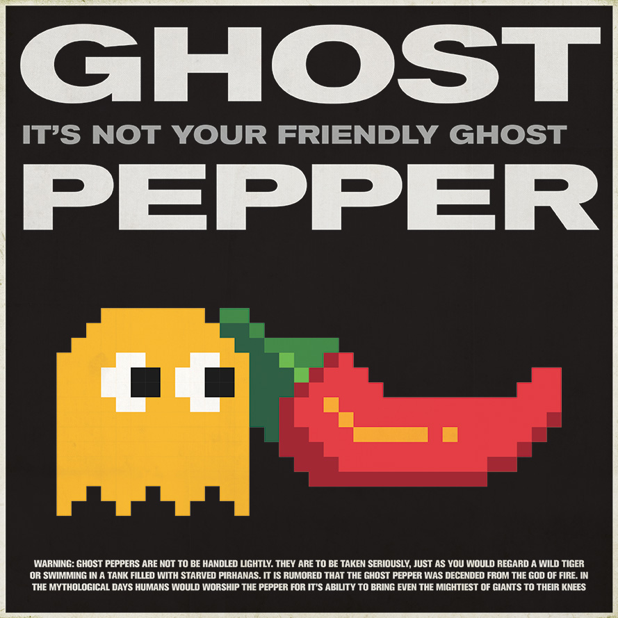
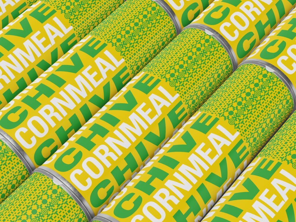
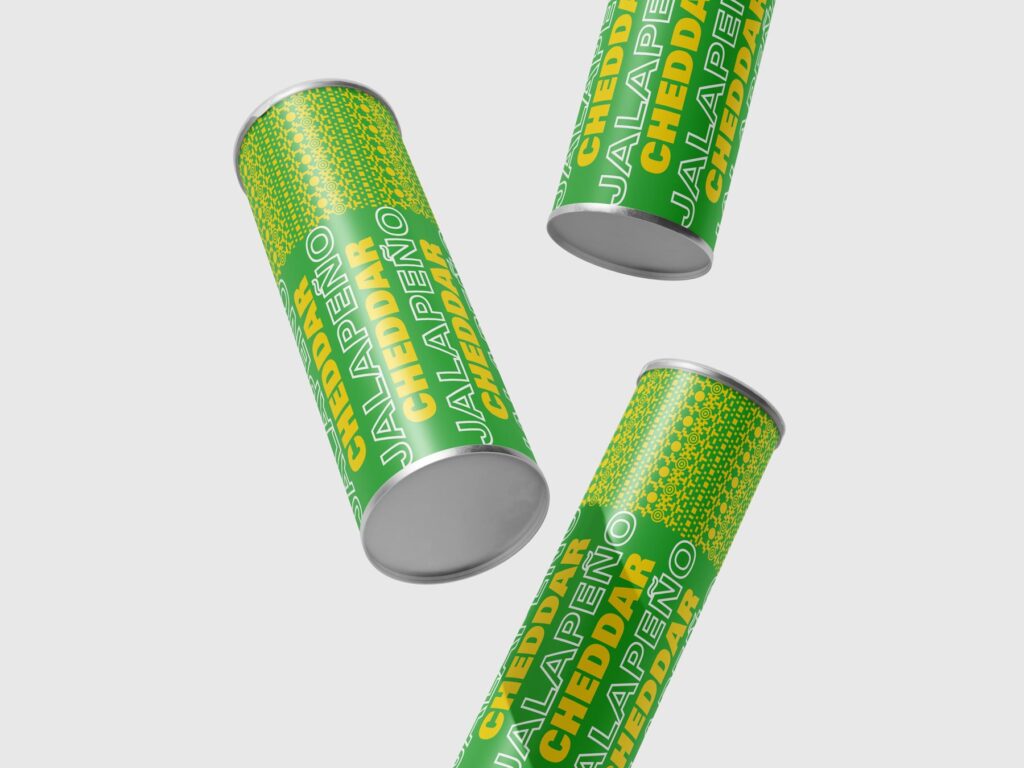
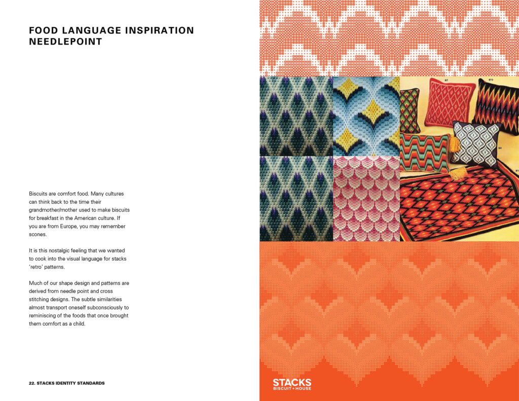
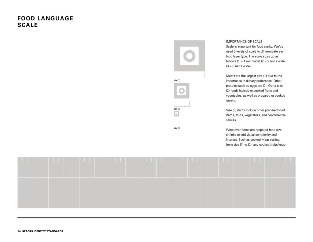
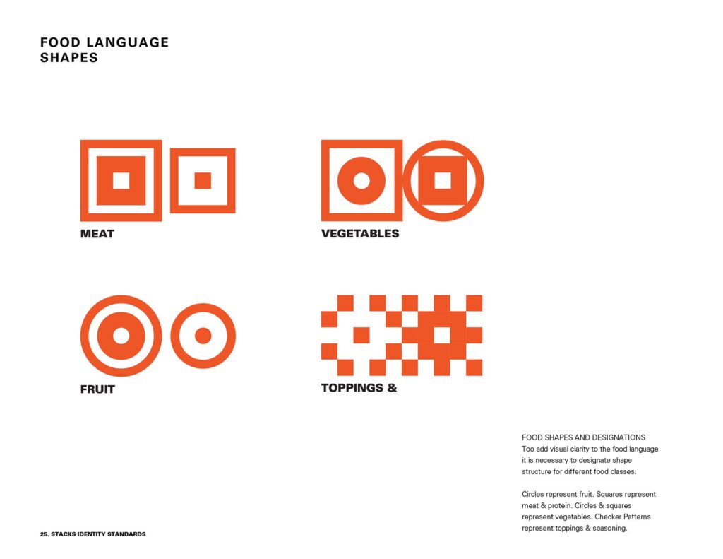
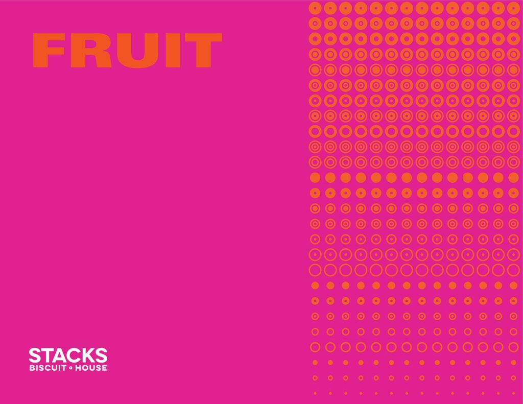
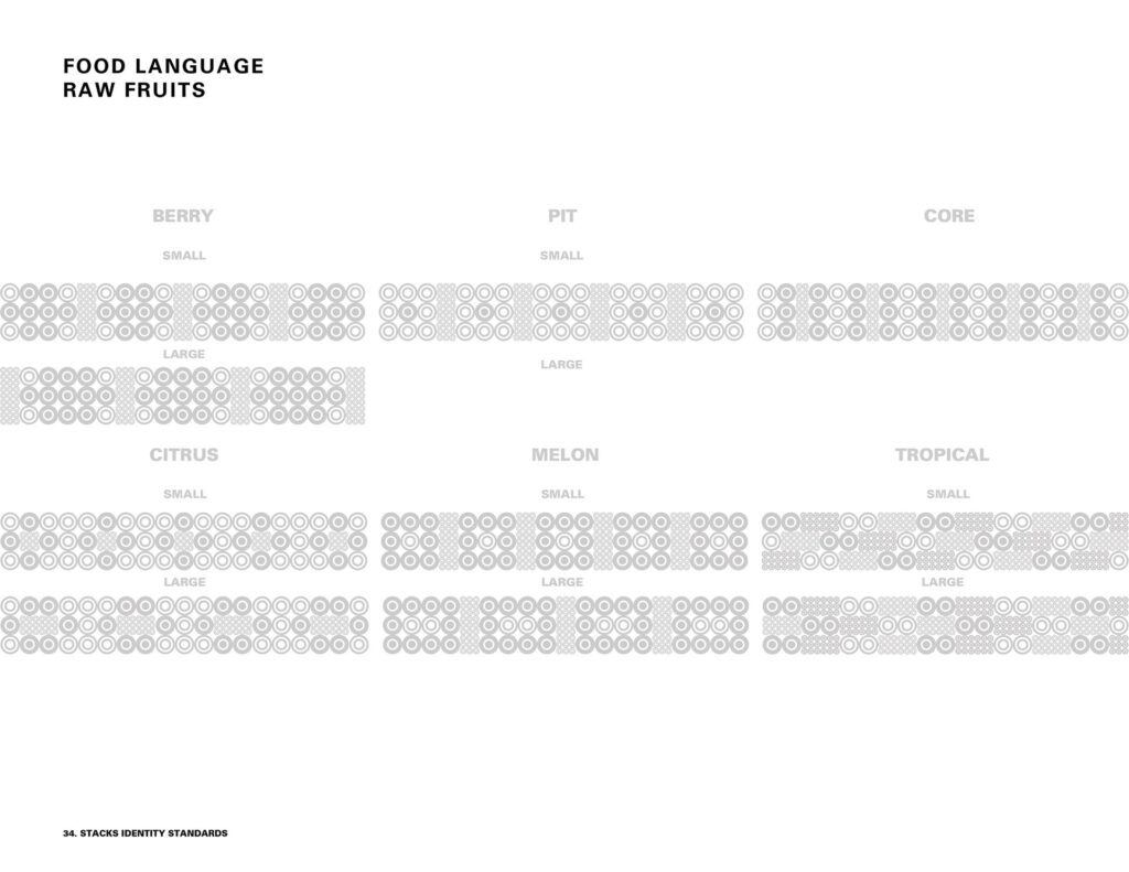
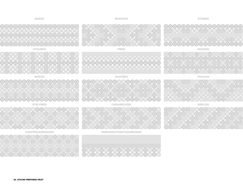
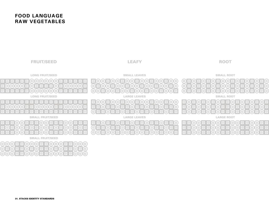
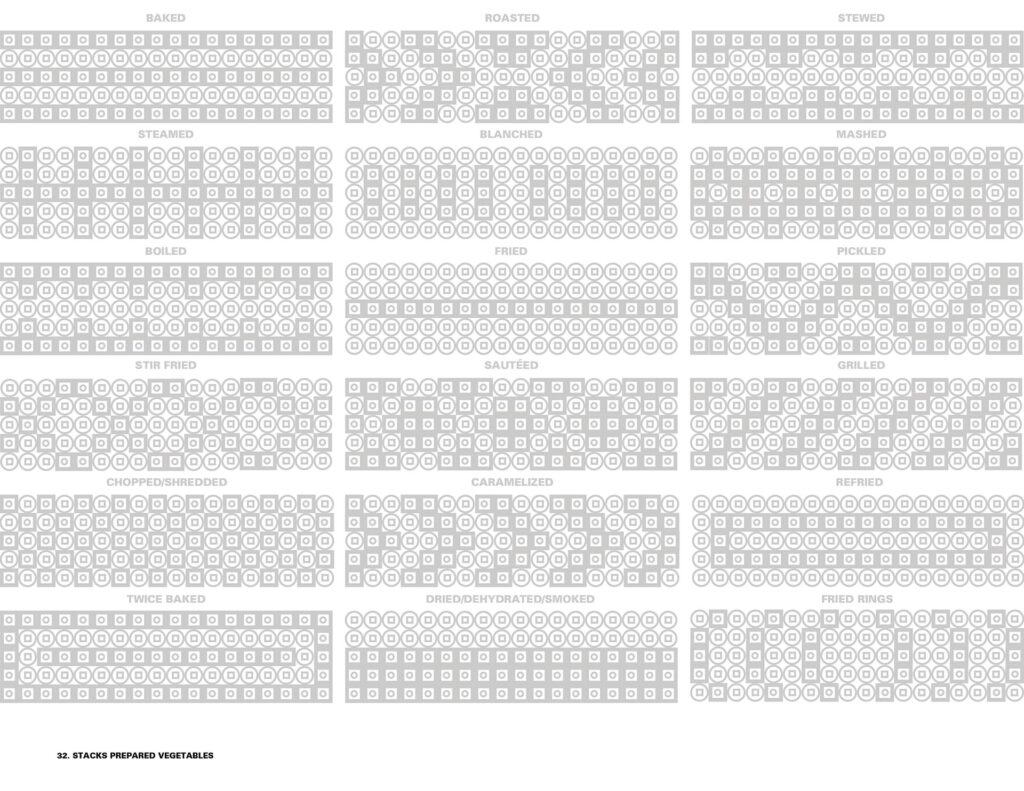
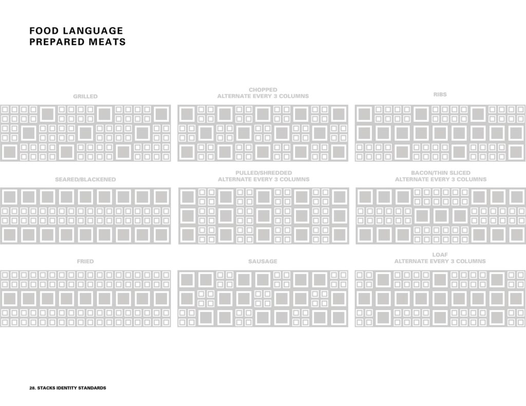
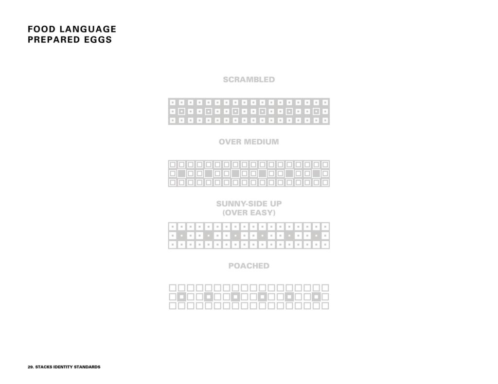
Have you ever seen a food language? Neither had we. That is when we knew we had something special to create as a ‘Stackable’ food language that could visually depict any item on stacks menu. Going for the blast from the past, we drew a lot of inspiration from cross knitting, bitmap video games, and old quilt like patterns. Then we made custom pixels based on shape combinations, scale choices, and a value hierarchy to create a variety of fun patterns.
This pixelated pattern language was used to illustrate package designs for menu items as well as the labels and packaging for the many stacks homemade butters, jellies, infused honeys, and hot sauces. The combinations are endless, and the results where stunning.