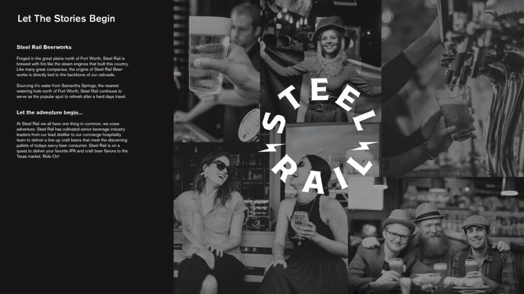
Forged in the great plains north of Fort Worth, Steel Rail is brewed with fire like the steam engines that built this country. Like many great companies, the origins of Steel Rail Beerworks is directly tied to the backbone of our railroads.
Sourcing it’s water from Samantha Springs, the nearest watering hole north of Fort Worth, Steel Rail continues to serve as the popular spot to refresh after a hard days travel.
Messaging
01
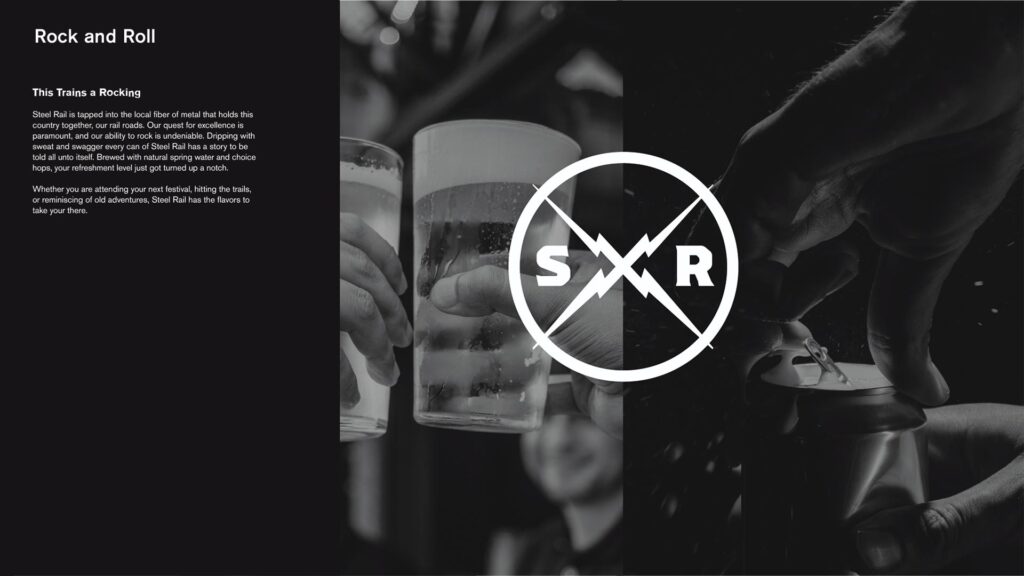
THIS TRAIN
IS ROCKIN
Steel Rail is tapped into the local fiber of metal that holds this country together, our rail roads. Our quest for excellence is paramount, and our ability to rock is undeniable. Dripping with sweat and swagger every can of Steel Rail has a story to be told all unto itself. Brewed with natural spring water and choice hops, your refreshment level just got turned up a notch.
Whether you are attending your next festival, hitting the trails, or reminiscing of old adventures, Steel Rail has the flavors to take you there.
Messaging
01
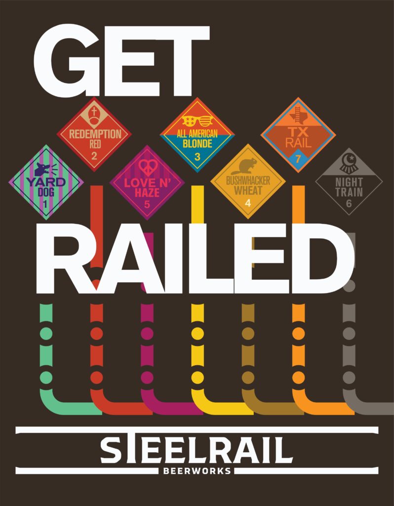
Unapologetically
BOLD
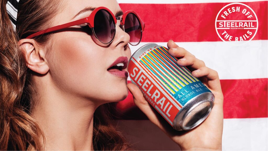
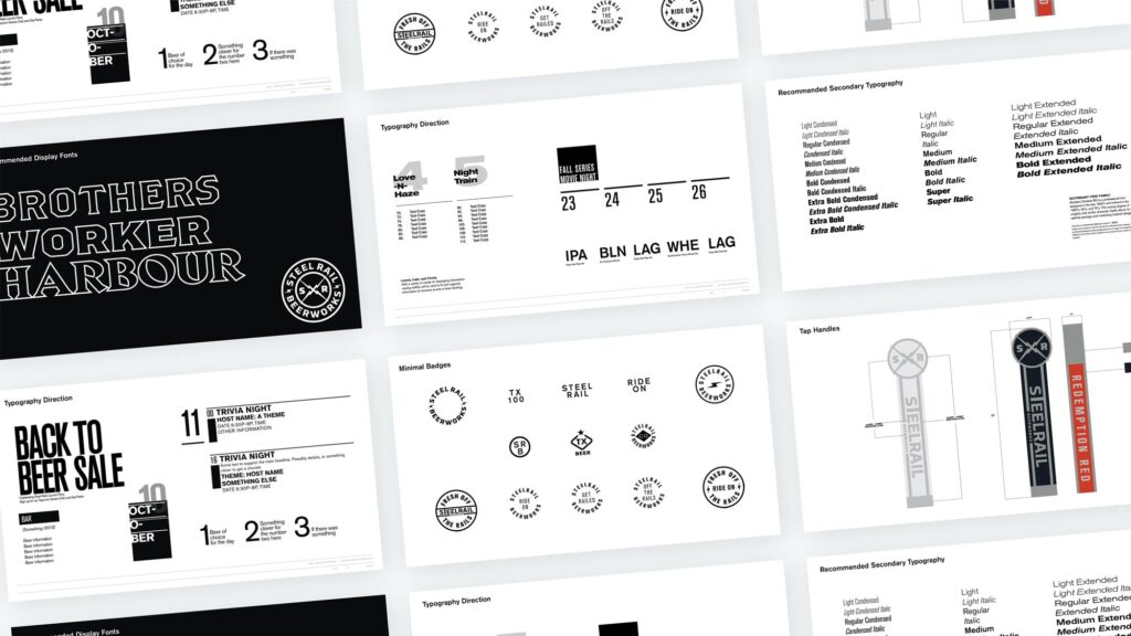
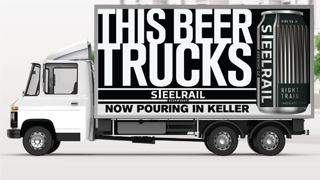
Coming out the gates swinging, our approach to headlines is unapologetically BOLD. That’s the Steel Rail way. Photos are worth a thousand words, but what is a Rock and Roll train brand without ruffling some feathers.
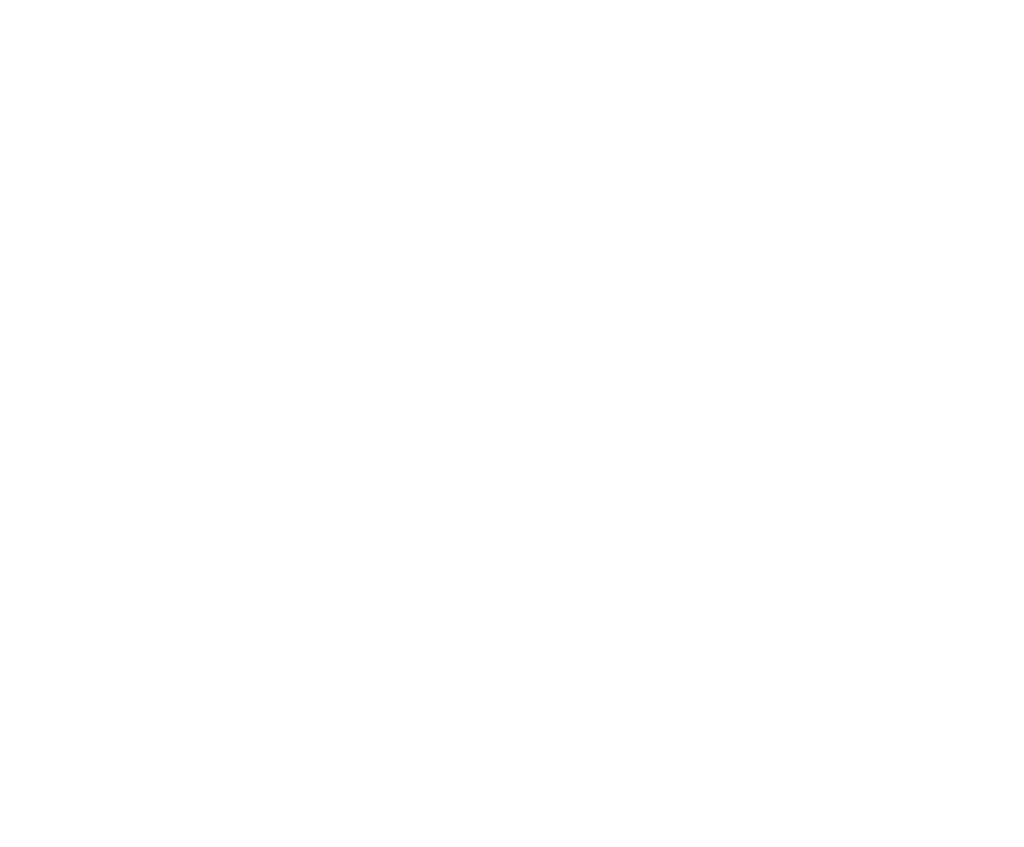
Marketing direction for Steel Rail will be driven by local culture photography, paired with BOLD headlines and clever body copy. The typography forward approach will visually communicate a level of sophistication that photos themselves don’t achieve.
After all, if we can’t be crafty with our text what can customers expect us to craft with our beer. With a combination of a classic san serif secondary font and select display fonts our message will be read loud and clear.
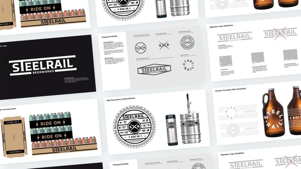
Package Design
02
Modern
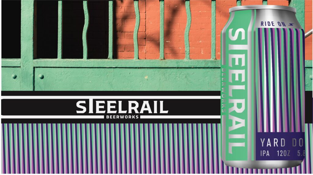
Box Garden
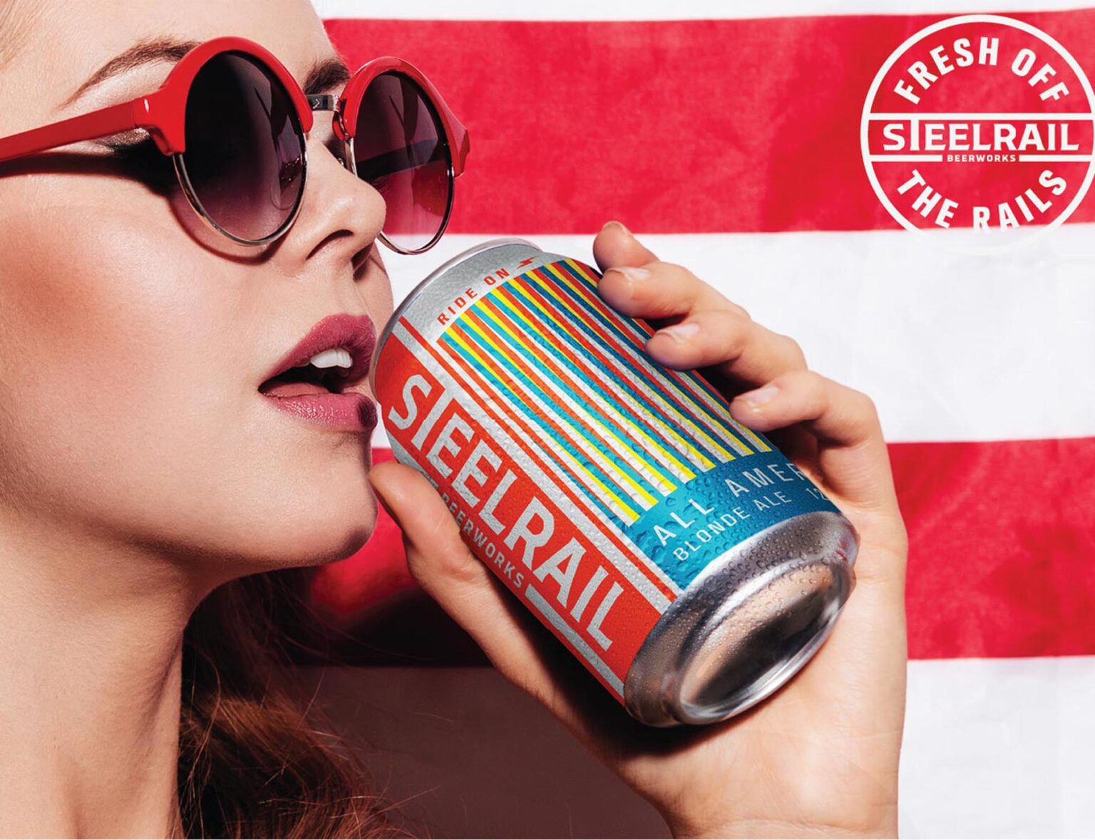
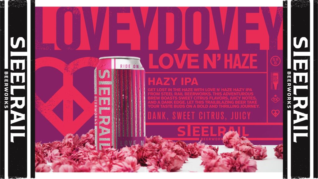
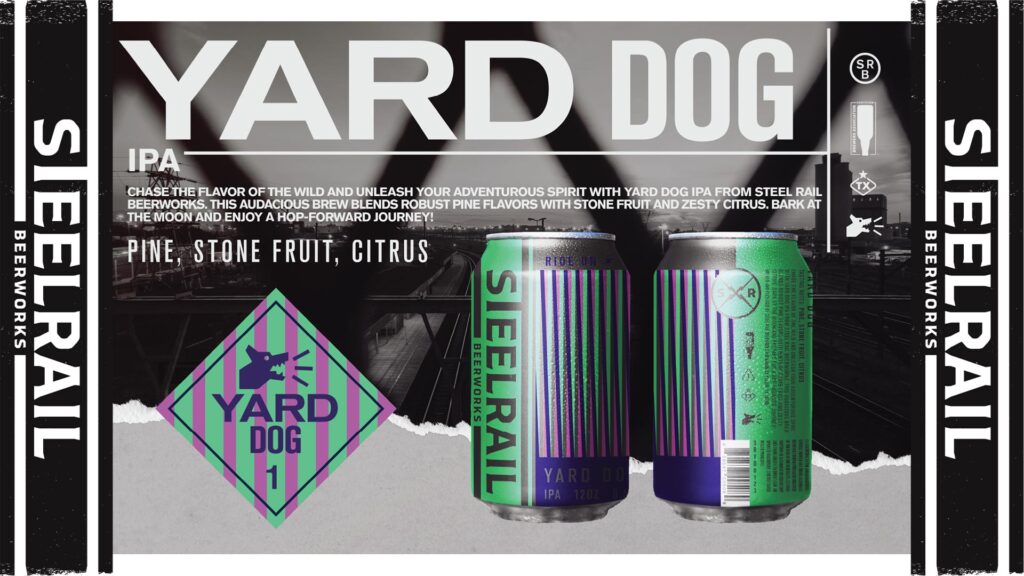
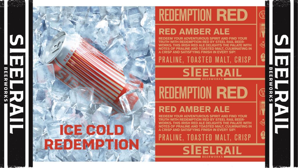
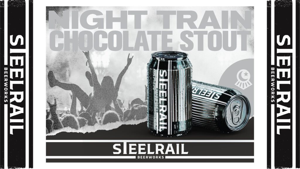
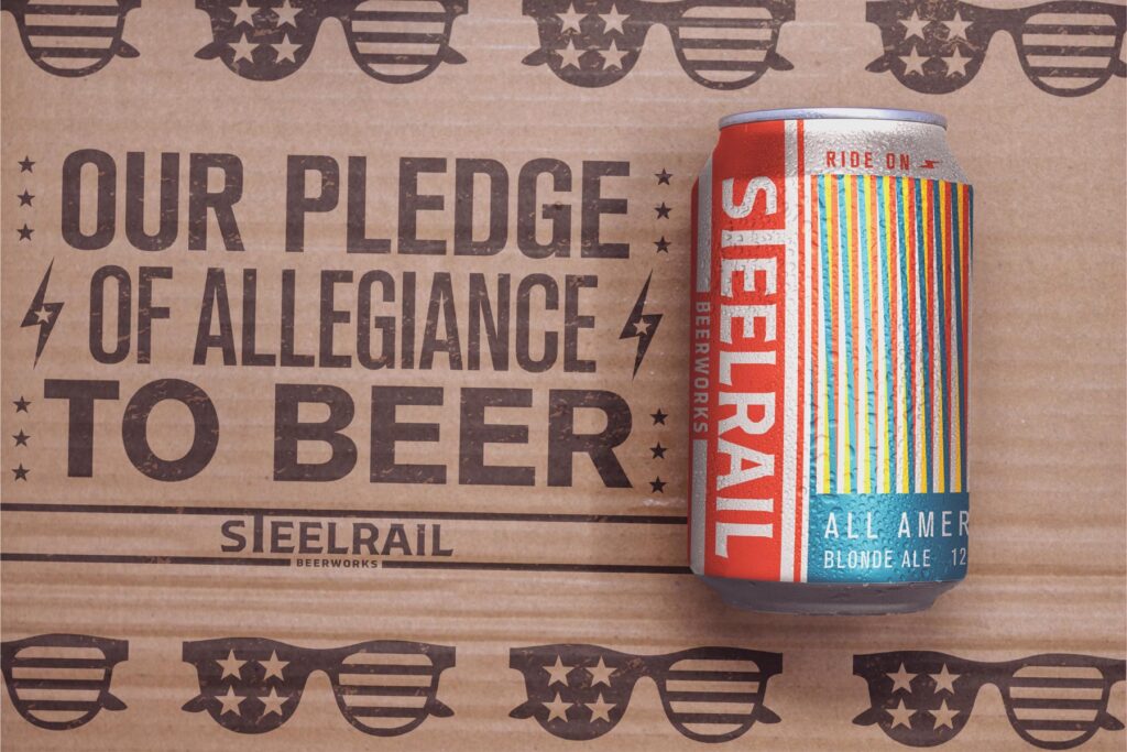
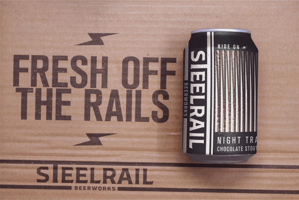
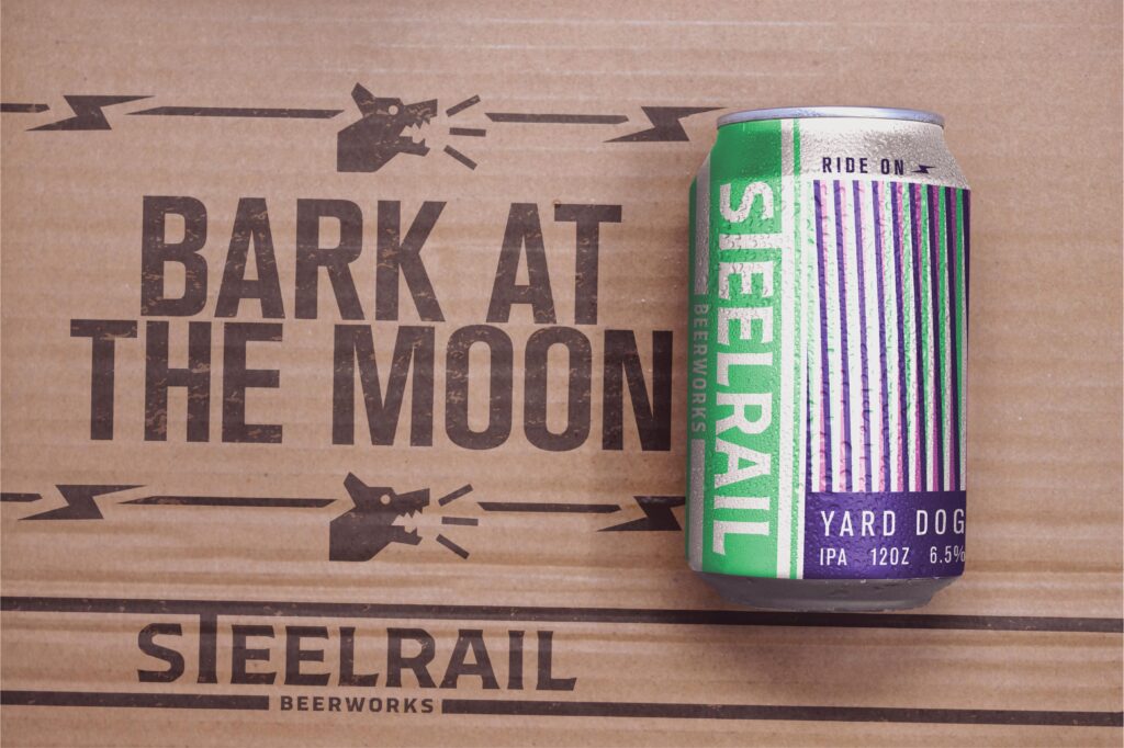
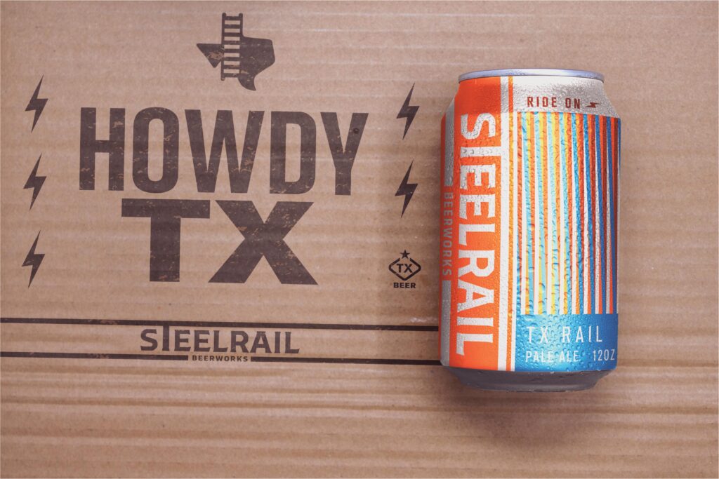
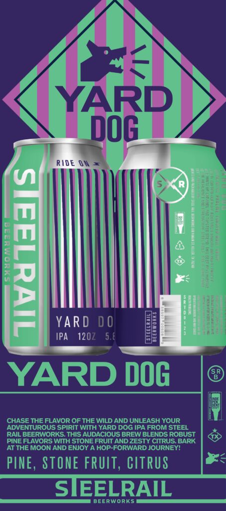
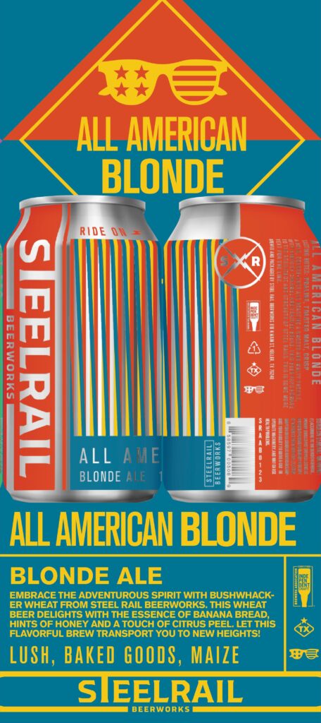
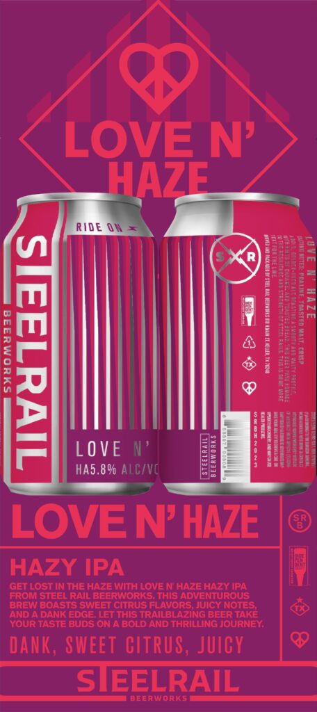
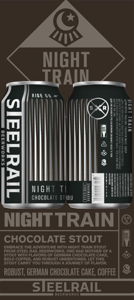
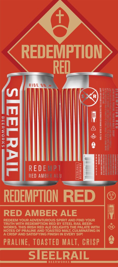
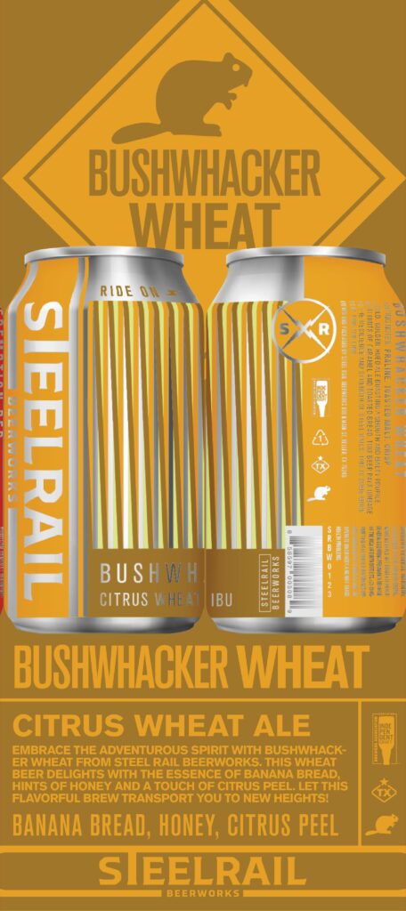
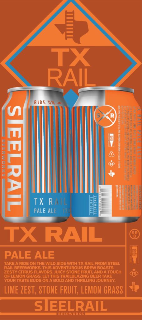
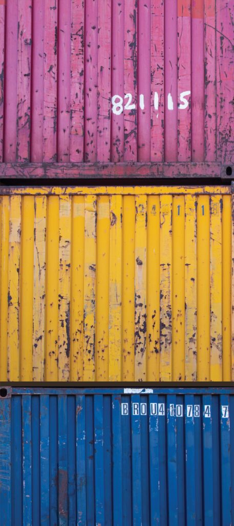
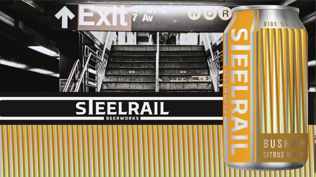
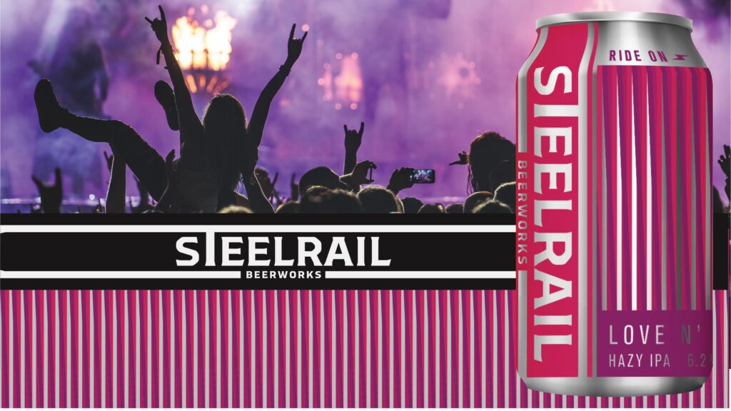
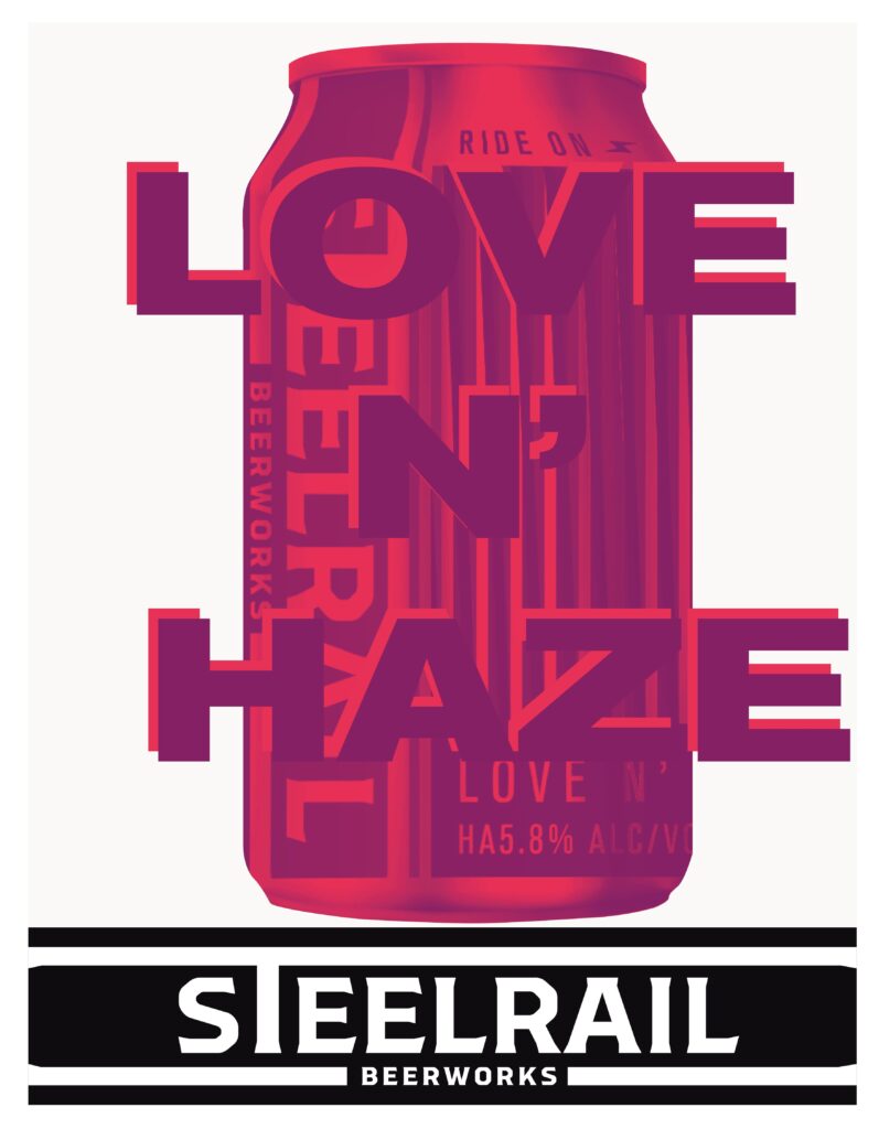
Form follows function. And if the goal was to activate a box garden while simultaneously placing beers in hands, this beers needed to fit the space. Drawing inspiration from the linear patterns of the railways and shipping containers we embraced the challenge of creating a linear pattern that created depth and motion.
Printing directly onto cans is not the cheapest method of packaging, but it saves on labor for and brings the element of the raw metal back to the cans. Allowing their shine to grab the viewers attention as they walk by the shelves.
The result of the final can design is a homage to Carlos Cruz’s airport textiles. The simple skewed geometric lines, combined with bold metallic colors begs you to turn the can and discover the details.
Branding
03
Rock and Roll
Train
With ties to the blue collar working class in North Texas, the ‘Hard Rock’ or should we say ‘Roll Hard’ messaging is well received. From attention grabbing headlines, to a sexy can design that will bring anyone to a screeching halt in the aisle, Steel Rail is poised for their new location.
When considering site activating the space. There was one guiding principle, Make it Rock. In the beer garden, the many tasting rooms, activity halls, and eateries, all cater to the many beer and spirit patrons. While on stage the live entertainment and busker program will keep the good times rolling.
Currently Steel Rail is entering the spirits market, bringing another level of rock and sophistication to the brewstillery space that has not been seen since the days of Valhalla.